Article
Building Your First Company Website In 3 Easy Steps
January 21, 2022
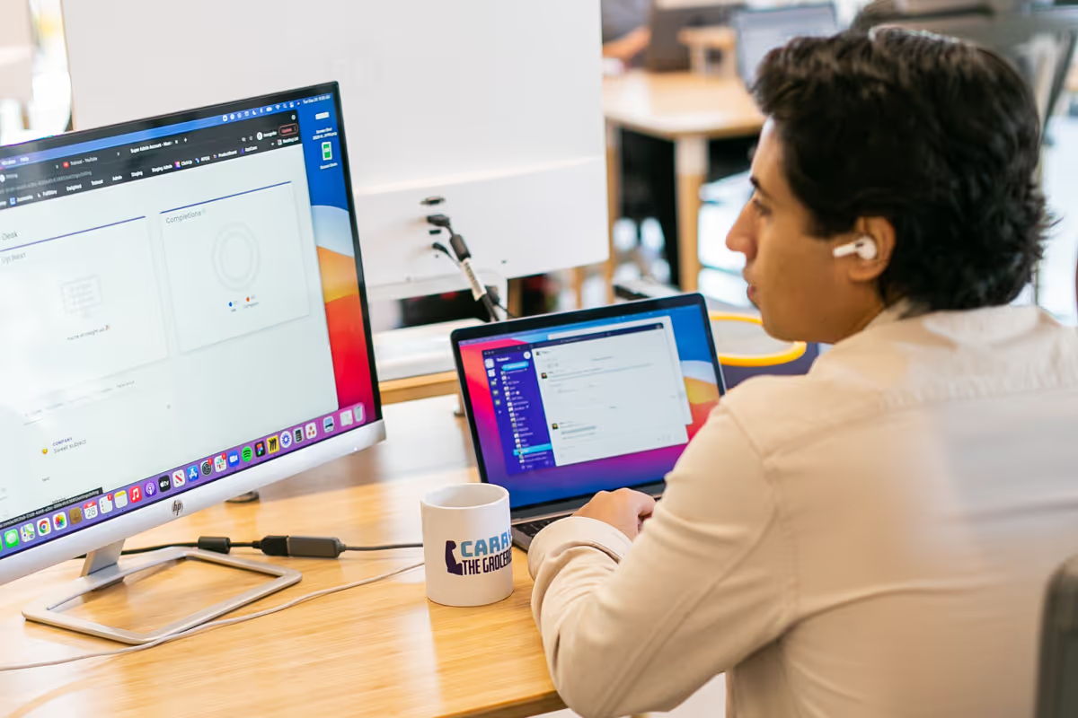
Your website is crucial for customers to find you online, interact with your brand, and take your business to the next level. Especially when you consider that over 60% of shopping experiences start online.
But if you’ve never built a website before (or tried and had challenges), you might feel reluctant to do it yourself. So, here’s a 3-step process for building your company website. It walks you through the entire project.
This guide contains everything you absolutely have to include on your site. That way, you can get your website up and running as soon as possible. Then, you can start reaching more customers online. And get back to running and growing your business!
1. Create a goal for a minimum viable product (MVP)
If you’ve ever struggled to launch a website before, it might be because you bit off more than you could chew. A website build can quickly become overwhelming when you add in too many complications at once. But when you start with something simple, you can build easier and launch faster.
We call this a minimum viable product, or MVP. Basically, it’s the minimum amount of information you need on your website to accomplish your most important goals.
Your website needs to contain enough information to explain what your business does, showcase your products or services, and allow customers to make a purchase. Any other content can wait until after launch (like a resource blog or customer success stories).
In other words, you want enough content to allow customers to engage with you in a meaningful way. But you also don’t need to cover everything. So, to put it plainly, keep your website basic at first.
That being said, there is some information that's crucial for your MVP. And your website should include the following elements:
Homepage
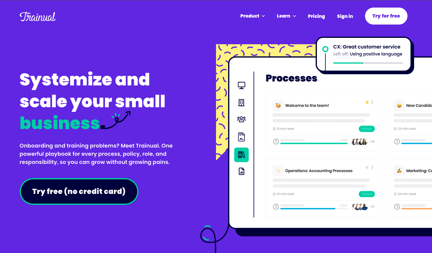
The homepage is the most important page on your website because it’s the first thing anyone will see. So you’ll want to make sure it clearly lays out who your business is and what you’re selling. And it provides a path to learn more or make a purchase for interested customers.
Plus, when you start with the homepage, it’s much easier to keep a consistent design across the entire website. Because once you finalize how the homepage looks and feels, you can apply the same elements to the rest of the pages.
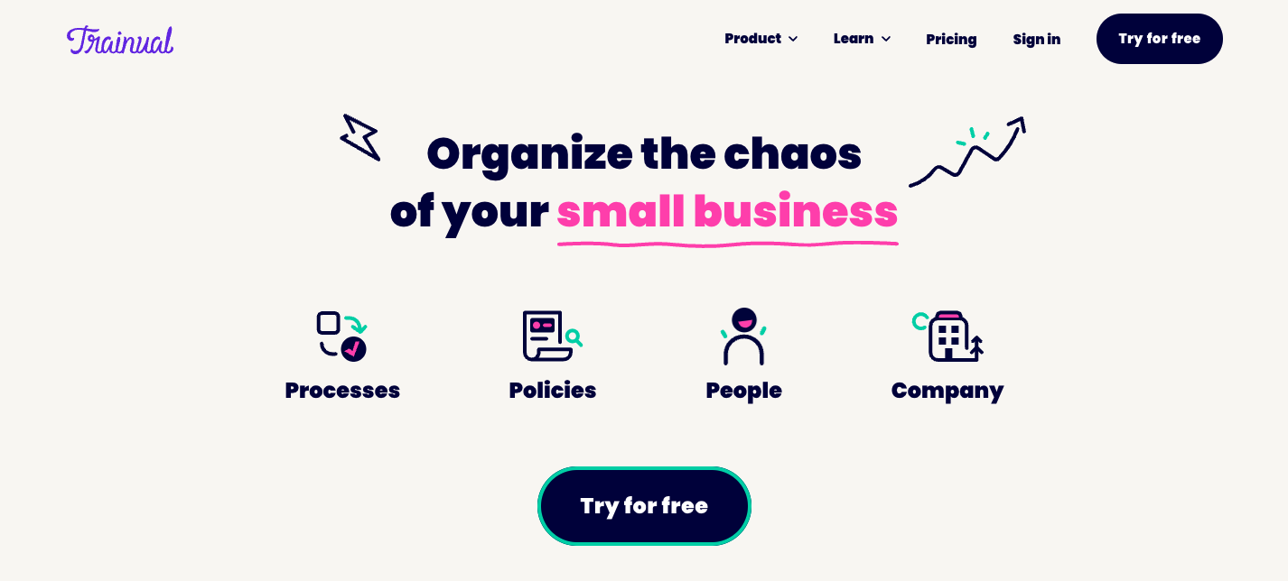
🔥 Tip: If you need an example, check out the Trainual homepage. You can see what types of content you should focus on (like our company information, product features, and a call-to-action to try Trainual for free). And you can get an idea of how to layout your most important page.
About page
Your about page will have information about the company - like your journey, purpose, and vision. You can also provide details about yourself as the business leader.
Either way, the content on this page is especially important for small businesses. Because it shows customers who you are as a company. AKA what values you stand for and what you’re trying to accomplish in the world.
Plus, when customers see the person behind your brand (and how hard you’re working to make something unique), they’re usually more willing to forgive the rough edges of your first website. Because it’s easier for customers to empathize when they can see the real people working in the business.
Product page
The product page shows what you’re selling (goods or services, physical or digital). And it provides a straightforward way for customers to make a purchase. Because the people who arrive on this page are obviously very interested in what you’re offering.
In other words, make sure you have a way to sell your product once you launch the website. It’s relatively easy to set up an inventory and POS system with most website builders.
And if you’re starting your website launch with a pre-sale, make sure there’s a way to collect customer information. That way, prospective buyers can get updates on when your offerings are available to purchase.
Contact Us page
The contact page is critical for customers who need help, whether they’re interested in your product or they’ve already purchased something and have questions. You can either set up a contact page with a phone number, email, or contact form, so people can reach out and get a response.
And depending on the level of contact you want to offer (and how quickly you or your support team can be available for customers), you can even include a chatbox tool for instant access to support.
In addition to your contact options, this page can also hold the links to all your social channels. Your customers may want to follow your social media to stay updated on your releases or to interact with your brand. And with social media links on your website, you can start building online loyalty to your business and broaden your customer reach.
Privacy Policy and Terms of Service Page
It’s likely you’ve seen links to a website’s Privacy Policy and Terms of Service, but never clicked on them. And while these pages can seem intimidating, they're actually pretty straight-forward.
Terms of Service explain how customers can use your website. Meaning, the disclaimer protects you and the company from customer abuse on your website. And a Privacy Policy page states how your company collects, handles, and processes visitor data. AKA, it protects your customer’s sensitive information.
Your website should have both pages. And even though the first page isn’t legally required, the second one is a non-negotiable. Because the Federal Trade Commission (FTC) requires that every website that collects data must have a privacy policy.
While both pages can seem a bit daunting, they’re important because they give your website credibility. Plus, there are many online template services to help you build them out. Just make sure to research the legal requirements specific to your industry and the type of company you operate.
2. Start building your website
Now that you have a rough plan, it’s time to start building your website! First, you’ll need to pick a website builder that works for you. Then you can begin building out the pages (from your MVP).
Each website builder has its pros and cons. And it all comes down to your preference and what you’re most comfortable using. But, if you need specific features for your website, that might be a good place to start looking.
Here are some of the best website builders of 2021:
If you have time to test platforms out, take advantage of their free trials. Use each platform to build the homepage. That way, you can decide which one fits your work style (and design taste) the best.
It’s also important not to stress about picking the wrong one. Because for the most part, all of these platforms provide an easy and intuitive process for building your website. Plus, as you build and grow your business, you can always move your website over to another platform that better fits your business’s needs.
3. Launch and polish your website
Once you’ve built out all your pages, it’s time to finalize the design and show the world your website! And if you stick to a simple MVP, this process shouldn’t take too long.
And while it might sound scary, it’s helpful to give yourself a tight schedule to launch. Because when you give yourself a deadline, you’re focused on getting the work done faster. And that’s the easiest way to learn which elements of the site are working and which ones aren’t.
At the same time, there will always be something to refine as you test out your site, whether it’s your content, design, or any type of graphic. And this is especially true as you get closer to launch day.
So, try running through the site several times on your own. Then, invite other people to scan it with fresh eyes.
If you expect a lot of initial traffic, you might want to spend more time refining your site before launching. But if you don’t anticipate a lot of visitors, you can save the editing until after launch. Because if your traffic is low, chances are good that no one will see your changes before you make them.
So, when you feel ready, hit publish on your website! Once the site is live, make sure your customers know it exists. Link to the website in your email signature and social media channels. And incorporate the website into all company collateral (business cards, proposals, and advertising).
You can also start following site traffic and tracking the performance quality of your website (Google Analytics is a great tool for this). The statistical data will help you improve the quality of your site and provide good marketing insight.
Take feedback from your customers as well. Their user experience will teach you where your website needs the most improvement. For example, let’s say a customer tells you that your homepage is too complicated. You can take the feedback and start eliminating some of the unnecessary information.
As long as your website is live, you’ll be refining pages. When you feel more comfortable with the website building platforms, consider adding more content to your site, like a blog or a page on customer success stories.
Congratulations, you’ve built and launched your very first company website! Now, you can start reaching more customers than ever before. Because with your official online presence, consumers can find you, interact with your brand, and take your business to the next level.
Similar Blog Posts
Article
Building Your First Company Website In 3 Easy Steps
January 21, 2022
Your website is crucial for customers to find you online, interact with your brand, and take your business to the next level. Especially when you consider that over 60% of shopping experiences start online.
But if you’ve never built a website before (or tried and had challenges), you might feel reluctant to do it yourself. So, here’s a 3-step process for building your company website. It walks you through the entire project.
This guide contains everything you absolutely have to include on your site. That way, you can get your website up and running as soon as possible. Then, you can start reaching more customers online. And get back to running and growing your business!
1. Create a goal for a minimum viable product (MVP)
If you’ve ever struggled to launch a website before, it might be because you bit off more than you could chew. A website build can quickly become overwhelming when you add in too many complications at once. But when you start with something simple, you can build easier and launch faster.
We call this a minimum viable product, or MVP. Basically, it’s the minimum amount of information you need on your website to accomplish your most important goals.
Your website needs to contain enough information to explain what your business does, showcase your products or services, and allow customers to make a purchase. Any other content can wait until after launch (like a resource blog or customer success stories).
In other words, you want enough content to allow customers to engage with you in a meaningful way. But you also don’t need to cover everything. So, to put it plainly, keep your website basic at first.
That being said, there is some information that's crucial for your MVP. And your website should include the following elements:
Homepage
The homepage is the most important page on your website because it’s the first thing anyone will see. So you’ll want to make sure it clearly lays out who your business is and what you’re selling. And it provides a path to learn more or make a purchase for interested customers.
Plus, when you start with the homepage, it’s much easier to keep a consistent design across the entire website. Because once you finalize how the homepage looks and feels, you can apply the same elements to the rest of the pages.
🔥 Tip: If you need an example, check out the Trainual homepage. You can see what types of content you should focus on (like our company information, product features, and a call-to-action to try Trainual for free). And you can get an idea of how to layout your most important page.
About page
Your about page will have information about the company - like your journey, purpose, and vision. You can also provide details about yourself as the business leader.
Either way, the content on this page is especially important for small businesses. Because it shows customers who you are as a company. AKA what values you stand for and what you’re trying to accomplish in the world.
Plus, when customers see the person behind your brand (and how hard you’re working to make something unique), they’re usually more willing to forgive the rough edges of your first website. Because it’s easier for customers to empathize when they can see the real people working in the business.
Product page
The product page shows what you’re selling (goods or services, physical or digital). And it provides a straightforward way for customers to make a purchase. Because the people who arrive on this page are obviously very interested in what you’re offering.
In other words, make sure you have a way to sell your product once you launch the website. It’s relatively easy to set up an inventory and POS system with most website builders.
And if you’re starting your website launch with a pre-sale, make sure there’s a way to collect customer information. That way, prospective buyers can get updates on when your offerings are available to purchase.
Contact Us page
The contact page is critical for customers who need help, whether they’re interested in your product or they’ve already purchased something and have questions. You can either set up a contact page with a phone number, email, or contact form, so people can reach out and get a response.
And depending on the level of contact you want to offer (and how quickly you or your support team can be available for customers), you can even include a chatbox tool for instant access to support.
In addition to your contact options, this page can also hold the links to all your social channels. Your customers may want to follow your social media to stay updated on your releases or to interact with your brand. And with social media links on your website, you can start building online loyalty to your business and broaden your customer reach.
Privacy Policy and Terms of Service Page
It’s likely you’ve seen links to a website’s Privacy Policy and Terms of Service, but never clicked on them. And while these pages can seem intimidating, they're actually pretty straight-forward.
Terms of Service explain how customers can use your website. Meaning, the disclaimer protects you and the company from customer abuse on your website. And a Privacy Policy page states how your company collects, handles, and processes visitor data. AKA, it protects your customer’s sensitive information.
Your website should have both pages. And even though the first page isn’t legally required, the second one is a non-negotiable. Because the Federal Trade Commission (FTC) requires that every website that collects data must have a privacy policy.
While both pages can seem a bit daunting, they’re important because they give your website credibility. Plus, there are many online template services to help you build them out. Just make sure to research the legal requirements specific to your industry and the type of company you operate.
2. Start building your website
Now that you have a rough plan, it’s time to start building your website! First, you’ll need to pick a website builder that works for you. Then you can begin building out the pages (from your MVP).
Each website builder has its pros and cons. And it all comes down to your preference and what you’re most comfortable using. But, if you need specific features for your website, that might be a good place to start looking.
Here are some of the best website builders of 2021:
If you have time to test platforms out, take advantage of their free trials. Use each platform to build the homepage. That way, you can decide which one fits your work style (and design taste) the best.
It’s also important not to stress about picking the wrong one. Because for the most part, all of these platforms provide an easy and intuitive process for building your website. Plus, as you build and grow your business, you can always move your website over to another platform that better fits your business’s needs.
3. Launch and polish your website
Once you’ve built out all your pages, it’s time to finalize the design and show the world your website! And if you stick to a simple MVP, this process shouldn’t take too long.
And while it might sound scary, it’s helpful to give yourself a tight schedule to launch. Because when you give yourself a deadline, you’re focused on getting the work done faster. And that’s the easiest way to learn which elements of the site are working and which ones aren’t.
At the same time, there will always be something to refine as you test out your site, whether it’s your content, design, or any type of graphic. And this is especially true as you get closer to launch day.
So, try running through the site several times on your own. Then, invite other people to scan it with fresh eyes.
If you expect a lot of initial traffic, you might want to spend more time refining your site before launching. But if you don’t anticipate a lot of visitors, you can save the editing until after launch. Because if your traffic is low, chances are good that no one will see your changes before you make them.
So, when you feel ready, hit publish on your website! Once the site is live, make sure your customers know it exists. Link to the website in your email signature and social media channels. And incorporate the website into all company collateral (business cards, proposals, and advertising).
You can also start following site traffic and tracking the performance quality of your website (Google Analytics is a great tool for this). The statistical data will help you improve the quality of your site and provide good marketing insight.
Take feedback from your customers as well. Their user experience will teach you where your website needs the most improvement. For example, let’s say a customer tells you that your homepage is too complicated. You can take the feedback and start eliminating some of the unnecessary information.
As long as your website is live, you’ll be refining pages. When you feel more comfortable with the website building platforms, consider adding more content to your site, like a blog or a page on customer success stories.
Congratulations, you’ve built and launched your very first company website! Now, you can start reaching more customers than ever before. Because with your official online presence, consumers can find you, interact with your brand, and take your business to the next level.
Article
Building Your First Company Website In 3 Easy Steps
January 21, 2022
•