Article
Your Favorite Playbook Has a Fresh New Look - Meet the New Trainual
June 1, 2020
Our long-awaited redesign is officially here (as of this morning), and we are so excited for you to experience it!
While our product might look a little different, we promise it still has all the power and grit you rely on to help you scale your business. But now, it’s better, faster (seriously, 4 times faster), and all-around more robust than before!
But when you log into your Trainual account, we don’t want there to be any surprises. So, here is everything you need to know about all that’s new with Trainual:
New navigation bar
The last thing we want is a menu bar that is bulky and distracting! So, we’ve made sleeker icons and moved these menus out of your way.
On Desktop, you will now find user settings at the bottom left of the page, combined with your account completion rate and notifications.
One-step to jump back in
Sometimes things come up, and users can’t finish the Subject they started! But we want to make it as easy as possible to pick content up where you dropped it off. Our platform now automatically saves your spot when you log off and allows you to jump right back in by clicking “Continue” in the announcement bar.
Easily filter content
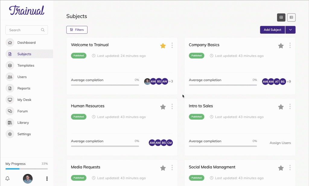
There’s nothing worse than not finding what you’re looking for, especially when you know it’s right in front of you! That’s why you can now effortlessly sort all your assigned Subjects with the improved content filter. To filter content, simply click the type of content that you want to view, like “Incomplete Subjects.”
Improved search results
If you can’t find the content you’re looking for anywhere or want to pull it up, simply type a keyword related to the Topic in the header search bar (it looks like a magnifying glass). With smarter logic, all inquiries are now met with more exact matches, providing you more accurate results.
Everything outlined in one place
The same outline experience you know is now all in one place! Without switching between pages, you can now add, rearrange, and update step tiles for each Topic to provide a more comprehensive overview of your content. Just select “Add Subject” to add, drag the “+” to rearrange, or click the pencil icon to update.
Larger workspace
We've relocated your user settings to be part of your primary navigation on the left side of the page. Everything you need access to is now in one place. This allows us to give you a broader view of your content so you can focus on doing one thing, building your business playbook.
Simplified process to preview edits
With the brand-new Admin toggle in the top right corner, you can now seamlessly preview what your team will see before you send it out. Simply toggle off "Admin.” If you want to make more edits, just toggle on again.
Improved mobile experience
We’ve made sure all of our new features are optimized for mobile phones to maximize your productivity, even on the smallest screen. That way, you can access, create, or edit content from anywhere (even on the go)!
Test BETA features
If you want to be the first to try all of Trainual’s upcoming updates, you can opt into the latest BETA features. You can set this up in your Account Settings, under “Advanced Settings.”
Got questions?
Change can be overwhelming - we get it!
So if you need help using or navigating the redesign, know that we are here for you. Feel free to chat with us in-app or email us at support@trainual.com.
Similar Blog Posts
Article
Your Favorite Playbook Has a Fresh New Look - Meet the New Trainual
June 1, 2020
Our long-awaited redesign is officially here (as of this morning), and we are so excited for you to experience it!
While our product might look a little different, we promise it still has all the power and grit you rely on to help you scale your business. But now, it’s better, faster (seriously, 4 times faster), and all-around more robust than before!
But when you log into your Trainual account, we don’t want there to be any surprises. So, here is everything you need to know about all that’s new with Trainual:
New navigation bar
The last thing we want is a menu bar that is bulky and distracting! So, we’ve made sleeker icons and moved these menus out of your way.
On Desktop, you will now find user settings at the bottom left of the page, combined with your account completion rate and notifications.
One-step to jump back in
Sometimes things come up, and users can’t finish the Subject they started! But we want to make it as easy as possible to pick content up where you dropped it off. Our platform now automatically saves your spot when you log off and allows you to jump right back in by clicking “Continue” in the announcement bar.
Easily filter content
There’s nothing worse than not finding what you’re looking for, especially when you know it’s right in front of you! That’s why you can now effortlessly sort all your assigned Subjects with the improved content filter. To filter content, simply click the type of content that you want to view, like “Incomplete Subjects.”
Improved search results
If you can’t find the content you’re looking for anywhere or want to pull it up, simply type a keyword related to the Topic in the header search bar (it looks like a magnifying glass). With smarter logic, all inquiries are now met with more exact matches, providing you more accurate results.
Everything outlined in one place
The same outline experience you know is now all in one place! Without switching between pages, you can now add, rearrange, and update step tiles for each Topic to provide a more comprehensive overview of your content. Just select “Add Subject” to add, drag the “+” to rearrange, or click the pencil icon to update.
Larger workspace
We've relocated your user settings to be part of your primary navigation on the left side of the page. Everything you need access to is now in one place. This allows us to give you a broader view of your content so you can focus on doing one thing, building your business playbook.
Simplified process to preview edits
With the brand-new Admin toggle in the top right corner, you can now seamlessly preview what your team will see before you send it out. Simply toggle off "Admin.” If you want to make more edits, just toggle on again.
Improved mobile experience
We’ve made sure all of our new features are optimized for mobile phones to maximize your productivity, even on the smallest screen. That way, you can access, create, or edit content from anywhere (even on the go)!
Test BETA features
If you want to be the first to try all of Trainual’s upcoming updates, you can opt into the latest BETA features. You can set this up in your Account Settings, under “Advanced Settings.”
Got questions?
Change can be overwhelming - we get it!
So if you need help using or navigating the redesign, know that we are here for you. Feel free to chat with us in-app or email us at support@trainual.com.
Article
Your Favorite Playbook Has a Fresh New Look - Meet the New Trainual
June 1, 2020
•