Article
Is Your Training On Brand? Here's Why That Matters
January 7, 2020
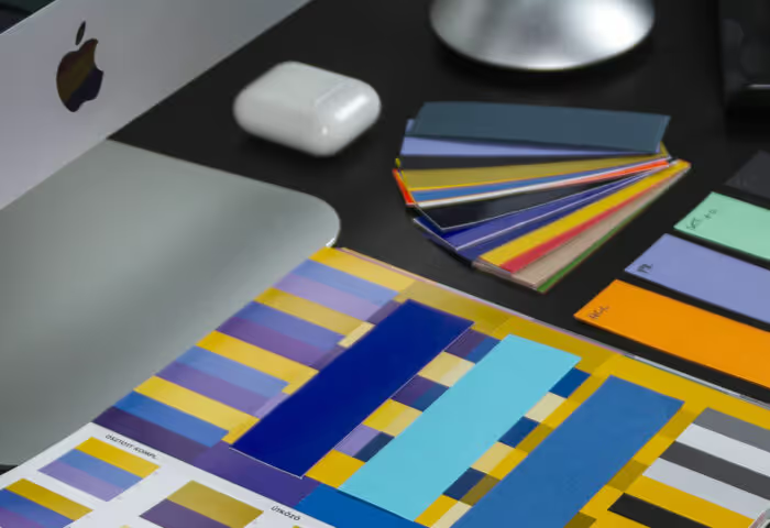
You know when you copy and paste something into an email or into a Word Doc or Google Doc and the formatting looks messed up? Well, hopefully, your next step would be to fix it.
You’d clear the formatting, update the font, and update the sizing so that everything looks the same. If you don’t do that, whatever you’re writing probably isn’t going to look so great to the end viewer.
Be like Apple
Let’s look at the brand of all brands, Apple, and the care and consistency that they take with their product packaging and advertising. You know it’s Apple when you see it. You can feel it. Every time.
This should be true across the spectrum of your company materials from product, marketing, internal communications – everything. Brand consistency shapes your product/service identity and helps everyone understand how the brand should look and feel.
Your internal team can then take that brand consistency mindset and apply it to anything they’re working on.
Branding your Trainual content
It’s the same thing when building out your Trainual content. One of the easiest ways to make your content look professional and cohesive with your business and your brand is to make sure that every piece of material looks and feels the same to the person that’s interacting with it.
That’s why we’ve introduced the Brand Styles feature within Trainual.
When you sign up for your account, just like you could before, you go through and add your logo, as well as your colors of buttons and links.
What’s different is now you can also update all of the fonts, colors, and sizes for the different paragraph formats like your headings and body text.
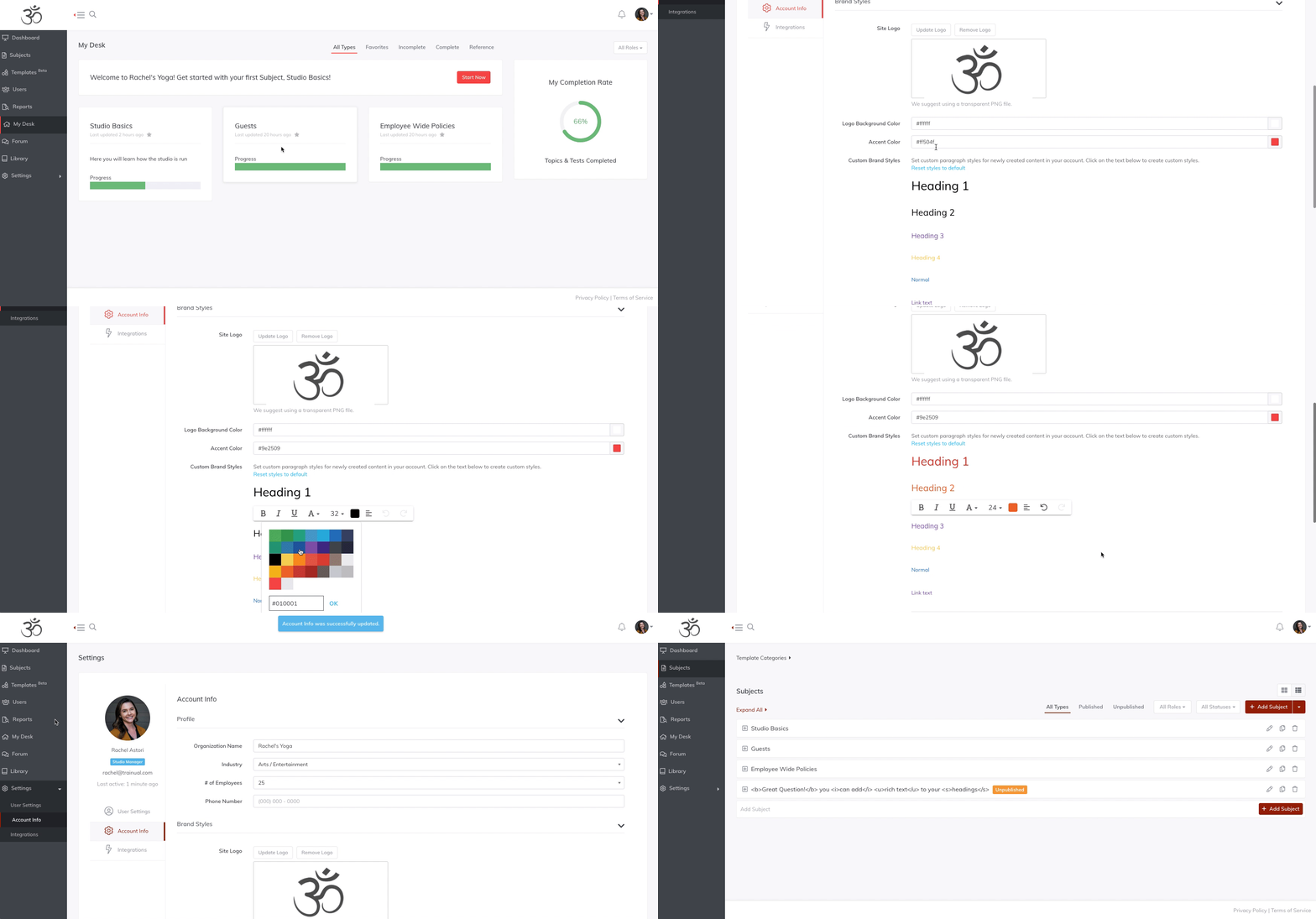
Once you’re happy with the Brand Styles you’ve set up, you can lock them so that whatever you set will apply to every subject, topic, and step across the board. That way, when a bunch of different people are adding content to Trainual, it will always look and feel the same.
If you decide you don’t want to use the Brand Styles feature, you can simply turn it off within your account settings. While you’re welcome to do that, we recommend keeping it turned on, otherwise, your employees will have a free for all adding any font type, colors, and sizes they please.
Leave a good impression
With Trainual being one of the first things that new employees touch when starting out at your company, it’s important to set a good impression by providing them thoughtfully crafted training material that excites them and familiarizes them with your brand.
The last thing you want to do is have a new employee reading through content that looks disorganized. We wanted to make it easier for your content to look professionally designed no matter what level of graphic design expertise your team has.
Similar Blog Posts
Article
Is Your Training On Brand? Here's Why That Matters
January 7, 2020
You know when you copy and paste something into an email or into a Word Doc or Google Doc and the formatting looks messed up? Well, hopefully, your next step would be to fix it.
You’d clear the formatting, update the font, and update the sizing so that everything looks the same. If you don’t do that, whatever you’re writing probably isn’t going to look so great to the end viewer.
Be like Apple
Let’s look at the brand of all brands, Apple, and the care and consistency that they take with their product packaging and advertising. You know it’s Apple when you see it. You can feel it. Every time.
This should be true across the spectrum of your company materials from product, marketing, internal communications – everything. Brand consistency shapes your product/service identity and helps everyone understand how the brand should look and feel.
Your internal team can then take that brand consistency mindset and apply it to anything they’re working on.
Branding your Trainual content
It’s the same thing when building out your Trainual content. One of the easiest ways to make your content look professional and cohesive with your business and your brand is to make sure that every piece of material looks and feels the same to the person that’s interacting with it.
That’s why we’ve introduced the Brand Styles feature within Trainual.
When you sign up for your account, just like you could before, you go through and add your logo, as well as your colors of buttons and links.
What’s different is now you can also update all of the fonts, colors, and sizes for the different paragraph formats like your headings and body text.
Once you’re happy with the Brand Styles you’ve set up, you can lock them so that whatever you set will apply to every subject, topic, and step across the board. That way, when a bunch of different people are adding content to Trainual, it will always look and feel the same.
If you decide you don’t want to use the Brand Styles feature, you can simply turn it off within your account settings. While you’re welcome to do that, we recommend keeping it turned on, otherwise, your employees will have a free for all adding any font type, colors, and sizes they please.
Leave a good impression
With Trainual being one of the first things that new employees touch when starting out at your company, it’s important to set a good impression by providing them thoughtfully crafted training material that excites them and familiarizes them with your brand.
The last thing you want to do is have a new employee reading through content that looks disorganized. We wanted to make it easier for your content to look professionally designed no matter what level of graphic design expertise your team has.
Article
Is Your Training On Brand? Here's Why That Matters
January 7, 2020
•