


Understanding how to create an organizational chart in Excel is a must for small-to-medium-sized firms that desire to display their enterprise's inner setup. This powerful tool allows you to design a clear and concise representation of your organization, making it easier for employees and stakeholders to understand the hierarchy within your business.
To begin, we'll examine the Hierarchy templates available on Excel's Insert tab before adding shapes to represent different positions within the organizational structure and customizing text content. We'll start by exploring various Hierarchy templates available under the Insert tab, followed by adding shapes representing different positions within the organizational structure. Additionally, we'll discuss customizing text content by typing directly into each shape on your org chart template.
Furthermore, we will cover techniques for enhancing your organizational chart design in Excel such as changing color formats and adjusting size manually for optimal readability. Finally, we'll explore alternative options for creating organizational charts that offer compatibility across devices/platforms like browser-based tools such as Trainual.
By mastering how to create an organizational chart in Excel, you can effectively communicate your company's internal structure with ease while maintaining a professional appearance throughout all aspects of your business documentation.
How to Create an Organizational Chart in Excel
How to create an organizational chart in Excel?
Using the SmartArt feature, Excel allows businesses to quickly create a visual representation of their organizational structure. By using the SmartArt feature, you can visualize your company's internal structure, hierarchies, and communication channels while customizing the design according to your needs.

Using the Insert Tab and Selecting Hierarchy Templates
To start creating your org chart in Microsoft Excel, follow these steps:
- Navigate to the 'Insert' tab on the ribbon at the top of your screen.
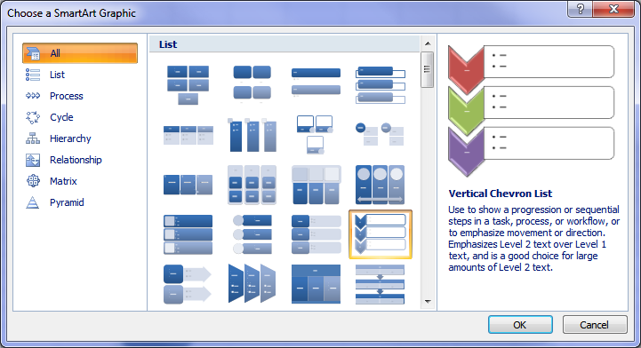
- Select 'SmartArt' from within this tab - this will open up a new window containing various graphic options.
- In this new window, click on 'Hierarchy' located in the left-hand column. This will display several org chart templates that you can choose from based on your desired format.
- Select one of these hierarchy templates by clicking on it once - then hit 'OK' to insert it into your worksheet as a SmartArt graphic object.
Adding Shapes Representing Different Positions Within The Hierarchy
The next step in how to create an organizational chart in Excel is populating your organizational chart with shapes representing different positions or roles within your company's internal structure.
To do so, select any shape within the existing hierarchy template (usually represented by rectangles). Then, click on the 'Add Shape' button located in the 'Design' tab under SmartArt Tools. Select an option from the drop-down menu to add a new shape either above, below, or beside your selected position.
This will automatically update your org chart with additional shapes based on reporting relationships between various roles.
Customizing Text Content by Typing Directly into Each Shape
To customize each shape's text content within your organizational chart, select any individual shape and start typing directly into it. This will replace any existing placeholder text with your desired input (e.g., employee names or job titles).
If you need to format specific words differently (e.g., boldface for emphasis), simply highlight them using standard keyboard shortcuts such as Ctrl+B for bolding. You can also adjust the font size, color, and other formatting options through Excel's built-in 'Home' tab under Font group settings while having the corresponding text selected inside a particular shape.
Enhancing this design further with color formats, size adjustments, and more will help make sure the information stands out for easy readability.
Enhancing Your Organization Chart Design in Excel
Now that you've created a basic organizational chart using the SmartArt feature, it's time to make your masterpiece stand out. To elevate your org chart from ordinary to extraordinary, let's explore some design features available in Microsoft Excel. These enhancements will make your chart more visually appealing and align it with your brand identity.
Changing Color Formats for Better Visual Representation
A splash of color can work wonders when trying to differentiate between departments or levels within an organization. In Excel, changing the background colors of individual shapes or lines connecting them is as easy as pie:
- Highlight the desired shape(s) by clicking on them.
- Navigate to the "Format" tab under "SmartArt Tools".
- In the "Shape Styles" group, click on "Shape Fill" and choose a color from the palette or select "More Fill Colors..." for additional options.
- To change line colors representing reporting relationships between roles, simply follow steps 1-3 above and click on "Line Color" instead of "Shape Fill".
Adjusting Size Manually for Optimal Readability
Sometimes bigger (or smaller) is better. Ensuring that text within each shape is easily readable without squinting can significantly improve user experience.
To manually adjust the size in Excel, select any shape(s) whose size needs adjustment by clicking on them individually while holding down the 'Ctrl' key (for multiple selections). Head over to the "Format" tab under "SmartArt Tools.". In the "Size" group, enter desired height and width dimensions or use up/down arrows for incremental changes.
With these design enhancements in place, your organizational chart will not only be informative but also visually appealing. Remember that a well-designed org chart can help employees understand their roles within the company's internal structure better and foster more effective communication channels.
By varying the dimensions and hues, you can construct an attractive and understandable organizational graph in Excel. Additionally, browser-based tools such as Trainual offer compatibility across devices/platforms for creating organizational charts with ease.
Alternative Options for Creating Organizational Charts
If you're not a fan of using Microsoft Excel or simply want to create professional-looking org charts without manual effort, fear not. There are alternative options out there that can help you achieve your desired format with ease. One such option is Trainual, an all-in-one platform that will help you document who does what at your business. With our interconnected Directory, Org Chart, Profiles, and Role Chart features, you can set up an easy-to-understand org chart that will help you and your employees distinguish where you all stand at your business.
Conclusion
Utilizing Excel's advanced design options and alternative tools, you can create an organizational chart that accurately reflects your company's structure. With enhanced design options and alternative tools available, you have the flexibility to create an organizational chart that best suits your needs. Having sufficient knowledge of how to create an organizational chart in Excel can give a comprehensive overview of your business's structure, whether it be basic or intricate.
Sign up now for a free 7-day with Trainual and scale your business!